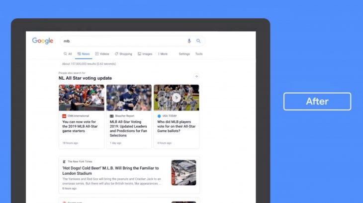
In the social network Twitter, the company published a video of the redesigned news section in the search engine’s desktop version. In the coming weeks, the new design will become available to all users.
The changes are in line with the efforts of the search giant to respond to publishers’ demands and needs and fight again fake news.
Over the next couple weeks we’re rolling out a redesigned News tab in Search on desktop. The refreshed design makes publisher names more prominent and organizes articles more clearly to help you find the news you need. Check it out ? pic.twitter.com/xa2aZfO4Qd
— Google News Initiative (@GoogleNewsInit) July 11, 2019
While it is early to give what the new news tab is up to, it is clearly a new step in a different direction. In the GIF published by Google that shows the change, the names of publishers appear on top of the titles.
The new news tab has adopted the format of Google News cards on desktop and mobile. Unlike the similar Google newsgroup you did in the search results, in the new view every news has its own card.
The new look not only expands the name of the publisher, but also organizes the items more clearly.
> Read Next: Visual concepts show how Pixel 4 XL looks like in real life
So what do you think about this? Let us know your thoughts in the comments section below, follow us on twitter and facebook for more news and updates.
