6 Important Image SEO Tips,

6 Important Image SEO Tips

6 Important Image SEO Tips

SEO or Search Engine Optimization is a vast field that encompasses not just the text on your website but also a lot of other aspects. These factors include the website load speed, response time, aesthetics, interface, and image optimization. Many website owners fail to recognize the fact that visual media also impacts SEO. Therefore, paying attention to elements like the size, format, load speed, and alt-text of an image on a website is crucial. Google, which represents around 90% of the overall search engine market, rarely returns search results without an images tab. In fact, nearly 28% of all queries come back with images. Moreover, 63% of users who click on an image that Google provides as a response to their query actually visit the source site of that picture, too. With these statistics in mind, it becomes fairly clear why image SEO is just as crucial as text SEO. And in order to get it right, here are a few tips that can help:

1. Make sure there are no copyright infringements in your visuals

The first step in image SEO, naturally, is to ensure that your images are free from copyright restrictions. Using copyrighted images without proper permission can result in legal consequences and damage to your website’s reputation. In order to avoid dealing with any of this, opt for royalty-free images. These can be freely used without the fear of any violations of copyright laws. Images that are open-sourced are an excellent resource, providing you with a wide range of high-quality visuals to choose from that fit various niches and themes. By incorporating these images into your site, you not only eliminate exclusivity concerns but also contribute to your website’s overall SEO performance.

2. Choose the right format

The next factor in ensuring proper image SEO is to ensure that you are using the right format. The file type that you choose for your images can significantly impact your website’s loading speed, which, as discussed above, is a critical SEO factor. Images come in various formats, with JPEG, PNG, and GIF being the most common. Each format has its strengths and weaknesses, but as far as website SEO is concerned, PNG and JPEG are preferred. JPEG is great for photographs, PNG is ideal for images with transparency, and GIF is suitable for animations. To optimize the speed at which your website loads, choose the format that best suits the type of image you’re using. For instance, WebP format with lossy or lossless compression is the only image format that Firefox and Chrome both support.

3. Compress and optimize the image

Once you’ve picked the right format for the images on your site, you need to fix their respective sizes. Large image files can slow your website down, negatively affecting the user experience and your SEO ranking. Popular options include TinyPNG and JPEG Optimizer. These tools remove unnecessary data from the image file, making it smaller without noticeable quality loss. To put this point into perspective, numerous tests performed by independent analysts have shown that image compression can improve website load speeds by almost 10%.

4. Build something truly unique

Having spent a lot of time on website performance and load speeds, let’s focus on another image SEO element that can influence the ranking of your site. More specifically, user retention through value-added content. That same old boring layout with cliché information is never going to keep a user interested for long. If a lot of users are leaving your website within a few seconds, Google flags this as a sign that the platform is not offering value, thus dropping it down the rankings considerably. While user retention is not just due to images, visuals do play a considerable role in SEO. So, it is best to consider creating custom visuals that align with your brand’s identity and messaging. If creating entirely custom visuals isn’t an option, look for royalty-free images that you can modify and make your own.

5. Set SEO-compatible file names

Another factor that can influence image SEO is the name that you give to your image files. Therefore, instead of using generic file names like “image001.jpg,” be descriptive and use relevant keywords. For instance, if your image is about a tropical beach, name it something like “tropical-beach-paradise.jpg” instead. This makes it easier for search engines to understand the content of your images and improves your chances of ranking higher in searches. Be sure to use hyphens to separate words in file names, as Google recognizes them better than underscores or spaces.

6. Edit the image alt-text

Alt-text, or alternative text, is essential for both accessibility and SEO. It provides a text description of your images for those with visual impairments and helps search engines understand the content of your visuals. When adding alt-text, be concise and descriptive, using relevant keywords. For example, if your image is of a red apple, your alt-text could be “Red apple on a wooden table.” This not only assists visually impaired users but also improves your image’s chances of appearing in relevant search results.

Conclusion

Image SEO is a critical factor in the search engine ranking equation. Many businesses and websites think of SEO solely as being dependent on the written content that’s featured on their website. However, as Google’s algorithms have evolved, this is no longer the case. If you want to make sure you’re ranking as highly as possible in searches, you need to make sure your visuals are all SEO-friendly. This guide is the perfect way to get started with that.

Check Next >https://www.neoadviser.com/hiring-for-success/



6 Things You Didn’t Know About Motion Graphics

6 Things You Didn’t Know About Motion Graphics

Motion graphics are a type of animation that is used to create movement and bring life to static images. In the past, motion graphics were used mostly for television commercials and title sequences. However, in recent years, motion graphics have become an important tool for web designers, video producers, and advertisers, while Singapore has been leading in these technologies. This city-state has produced some of the world’s most iconic and award-winning motion graphics. Here are six things you may not have known about motion graphics.

Creating Amazing Visual Effects

One of the most common uses for motion graphics is in advertising and video production, where movement is often used to draw attention to certain elements and to convey information more effectively. For example, a company might use animated text or images to highlight their products or services and add interest to their ads. Therefore, when looking for animation studios in Singapore or other parts of the world, it is important to work with a team that has experience creating motion graphics, where the local aspect is not as important as the quality of the studio’s work. Make sure to ask potential vendors about the types of effects they can create, such as motion tracking and keying or compositing.

Making Static Imagery Interactive

Another popular use for motion graphics is in web design, where animation can be used to make static images more engaging and interactive. For example, a website may use subtle movements like parallax scrolling to add depth and dimension to its pages. Additionally, many sites now use animated GIFs to add personality and life to their content. If you’re looking to add some movement to your site, be sure to work with a web designer who has experience creating motion graphics.

3D Graphics Aren’t Just for Movies Anymore

Traditionally, motion graphics were created using computer-generated imagery (CGI), which is used in many movies and television shows. However, with advances in technology, it is now possible to create custom 3D animations at a fraction of the cost. As a result, more businesses are using 3D graphics for things like product demos and promotional videos. If you’re interested in creating 3D animations for your business, the animation company you hire must have experience creating quality CGI.

Motion Graphics and Video Editing

One of the most exciting things about working with motion graphics is that many of the same techniques can be used to improve video editing as well. Motion tracking, for example, can be used to stabilize shaky footage or to add special effects to live-action video. Additionally, many of the same software programs that are used for creating motion graphics can also be used for video editing, making it easy to integrate both disciplines.

You Don’t Need an Expensive Camera

In the past, motion graphics were often created using expensive cameras and specialized equipment. However, in recent years, many of these tools have become more affordable, making them accessible to a wider range of businesses. Even apps like Instagram now allow users to create short video clips with their smartphones. So if you’re just starting with motion graphics or are on a tight budget, you will find that there are plenty of affordable options available.

It Helps Your Brand Stand Out

One of the biggest benefits of using motion graphics is that they help your brand stand out from the crowd. Whether you’re creating an ad, a video, or a website, high-quality motion graphics will capture the attention of your audience and help your product or service to stand out. If you’re looking to increase brand awareness, it is important to work with a motion graphics company that can create high-quality animations that effectively convey your message.

As more and more businesses seek to add movement to their content, the use of motion graphics has become an essential tool for those in the advertising, web design, and video production industries. Whether you’re looking to add some life to your website or want to create an engaging promotional video, working with a motion graphics company in Singapore or elsewhere, is a great way to achieve your goals.

Check Next >https://www.neoadviser.com/want-to-hire-an-animation-studio/

What Makes a Book Cover Effective? Find Out Here!

What Makes a Book Cover Effective? Find Out Here!

What Makes a Book Cover Effective? Find Out Here!

Writing a book is an incredibly rewarding experience – it allows you to explore your creativity and create something truly unique. However, writing a book is also hard work – no one ever said it would be easy! It can sometimes take years to finish your story, and you might think that once you accomplish that, the work is over. But that’s not quite true – you also need to make sure your book has effective covers if you want it to be successful. It’s hard to overstate the importance of a good book cover. With so much competition out there, it’s essential for authors to put thought into what their book covers look like and make sure they’re effective in marketing the book. So, what makes a book cover effective? Well, there are a few key things to keep in mind.

1. Hardcover Or Paperback?

The material of your book cover is incredibly important. It needs to be something that will stand out and catch people’s attention. Even though the saying goes – don’t judge a book by its cover – according to professional book cover designers in Canada, making snap judgments about a book based on its cover is exactly what most people do. So the first thing you want to decide on is whether you want your book to be hardcover or paperback. The advantage of going with the hardcover is that it will be more durable and likely to last longer. It provides a more luxurious feel for the reader and can give your book more prestige. However, it’s also more expensive to produce and can be bulkier to store, which means that the retail price will have to go up. On the other hand, paperback books are amazing for marketing because they’re cheaper to produce and can be easily distributed. They’re also more lightweight, which makes them perfect for travel. If you’re using a hardcover, make sure the spine is interesting and catches the eye. If you’re using a paperback, make sure the front and back covers are eye-catching.

2. Imagery

The images on your book cover are another important factor to consider. They should be chosen carefully and thoughtfully in order to represent the tone and theme of your book. As with the material, it’s important to choose something that will stand out and be visually appealing. You also want to make sure the images are relevant to the story – for example, an image depicting water would be the perfect picture for a book about a mermaid, sailors, or the ocean. Similarly, if you’re writing a mystery novel, you might want to use an image of a detective or a crime scene. The key is to make sure the images are interesting and tell a story of their own. As a general rule, try to avoid using too many images or too much text on your book cover. It can be overwhelming for readers and cause them to lose interest. Stick to one or two strong, eye-catching images and let the title and author’s name speak for themselves. A good designer will be able to help you choose the right images for your cover and make sure they tie in with the story.

3. Typography

The typography on your book cover is also important. It should be easy to read and match well with the overall design of the cover. You don’t want to use too many different fonts, as it can be visually jarring for readers. Try to stick to one or two fonts at most, and make sure they complement each other. The font you choose for the title should be easy to read and stand out against the background. The font for the author’s name should be sleek and simple. As with the images, you want the typography to be visually appealing and representative of the tone of your book. You might also want to consider how you can use different fonts to establish a message the book is about. If your book deals with dualities, for example, you might want to use two different fonts to represent them. On the other hand, sticking to a simple, classic font can be just as effective.

4. Colors

The colors on your book cover are another important consideration. They should be chosen carefully in order to create a cohesive look and feel for the cover. You want to use colors that will stand out and attract attention. However, you also want to make sure they’re appropriate for the tone and theme of your book. For example, if you’re writing a children’s book, you might want to use bright and vibrant colors. If you’re writing a mystery novel, you might want to use dark and muted colors. As with the other elements of the cover, it’s important to choose something that will be visually appealing for readers while still staying true to what the book is about.

5. Branding

Your book cover is a crucial part of your brand, and it’s often the first thing potential readers notice. As book cover designers in the USA know, a cover that makes a strong first impression is key. To create a memorable and unique cover, it should reflect the tone and theme of your book. Additionally, you want to ensure your cover is consistent with your other marketing materials, such as your website and social media profiles, to maintain a professional and polished look. A well-designed book cover is especially important if you’re writing a non-fiction book, as readers will be looking for information about you and your work. A professional cover can help you stand out from the competition and attract new readers, ultimately leading to the success of your book.

6. Versatility

Your book cover will also need to be adapted for different editions, such as hardcover, paperback, and digital versions. The cover design should be able to adapt to different sizes and formats while still retaining its overall look and feel. As with all other aspects of the cover, you want to make sure the typography, images, and colors are consistent across all editions. Additionally, if you plan on writing any sequels, you want to make sure the cover design can be easily adapted for them. A good designer will be able to help you come up with a design that’s versatile and easy to adapt for different formats and editions. The most effective book designs, when it comes to sequels, are those that keep up with the branding of the original book and don’t try to stray too far from it, while still bringing something new to the table.

Designing an effective book cover can be a daunting task, but if you keep these six things in mind, you’ll be on your way to creating a cover that catches readers’ attention and represents your book in the best possible light. Whether you decide to do it yourself or have an expert help you, make sure to put thought into every aspect of the design so that it’s both visually appealing and representative of your book.


Build Your Brand - 5 Powerful Methods for Establishing a Positive Brand Presence,

Build Your Brand – 5 Powerful Methods for Establishing a Positive Brand Presence

Build Your Brand – 5 Powerful Methods for Establishing a Positive Brand Presence

The way you present your brand lets your audience know who you are, but only if you successfully establish a positive brand presence. To create the successful image you’re striving for, there are multiple factors at play. Today, we’re going to help you get a head start with powerful methods for establishing a positive brand presence. 

1. Reach Out 

Giving out custom promotional products is a great way to establish yourself in the community. When customers and clients receive branded giveaways, they remember who you are, sometimes for years. The only caveat to this is that the items you give out must be genuinely useful and of the highest possible quality. Giving out useless items (think plastic novelties and poor-quality pens) can have the opposite effect, leaving a lasting negative impression in people’s minds. 

2. Give Your Community Valuable Content

You can become a trusted source of information within your industry by putting out valuable content. If your audience trusts what you share, they will pass that information on to their network, further establishing your positive brand presence. Blogs are a great starting point, but statistics say that video could well be the way to go:


  • Social video creates over 1,000% more shares than images and text put together;
  • 86% of people want to see more videos from brands;
  • Audiences take in 95% of a message in video form compared to just 10% when they read the same message; 
  • Consumers who go to a website through video are nearly 200% more likely to buy (and they tend to spend nearly 50% more).


(Statistics Source

3.Use The Right Colors

Using the correct coloring is essential for branding because it keeps your company image coherent and consistent. Color is also highly emotive and has a staggering impact on brand recognition.


Are your brand colors impactful? Are you using the same scheme across all websites, social media platforms, and correspondence? By using the right colors in your marketing and ensuring they are consistently present in your visuals, you can boost your presence across the board. 


4.Be The Person, Not The Brand

To make a powerful impression on potential customers, your brand has to show who it is, not just what it sells. Developing a language that speaks to your audience is a good way to get started. 


You could also try utilizing behind-the-scenes videos, introductions to different staff members, real human responses to inquiries, and social media posts. On top of this, you may also want to design specific campaigns that show the human side of your business. There are multiple ways to humanize your business, all of which will help boost your brand presence. 


5. Make It Easy For Your Audience To Shout About You

As a brand, you already have an audience that has a positive impression of you. Do yourself a favor and make it easy for them to share their positive feelings about your business. Creating shareable, original content is a great start. 


If somebody they know sees them posting about your brilliant brand, that person will naturally want to know more about you and what you have to offer. Try including share buttons, quick links to content, and share suggestions as these all place your audience one click away from spreading your brand far and wide. 

“If individuals believe they share values with an organization, they’re going to keep loyal to the complete.” – Howard Shultz, chief operating officer of Starbucks

With a solid plan in place, you can boost your brand presence for better business growth, visibility, and sales.

Check Next >https://www.neoadviser.com/tips-for-starting-an-eco-friendly-lifestyle/


Tips to give your bedroom an expensive hotel suite feeling,

Tips to give your bedroom an expensive hotel suite feeling

Tips to give your bedroom an expensive hotel suite feeling

Are you bored with the look of your bedroom? If you are looking for ways to make it give you a luxurious hotel vibe, this place is just for you. Keep reading.  It’s easier than you think to make your bedroom more luxurious. It doesn’t matter what style the room is; you can achieve a luxurious feeling. You can design it in such a way that it gives you a sense of harmony and homeliness. You can transform your bedroom without breaking the bank.  These tips to give your bedroom an expensive hotel suite feeling will help you achieve that.

Update your bed linen

A simple and inexpensive way to transform your bedroom’s look is to get luxury bedding. Then, for a more stylish look, you can match your bedding with your curtains and cushions.

Make a blanket statement

You don’t need to worry if you cannot afford luxury bedding. Instead, focus on your throw. A thick, chunky knit throw will emphasize your comforter or duvet.

Layer those pillows

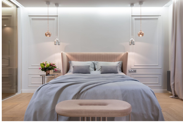
This is probably the simplest trick you can follow. In a typical luxury bedroom, you will see layers and layers of pillows placed against the headboard. You can also make use of your spare pillows, so you don’t have to spend a lot. A luxurious look can be achieved with a carefully arranged collection of colorful, symmetrical pillows. The layering will not only look great but will also make your bed much more comfortable.

Raise the Curtains

The smallest, most expensive bedrooms are often small and boxy. If you find yourself in this position, raise the curtains a bit higher to create some illusion of more space. If you place the curtain rod just a few inches below the ceiling line and hang the drapes to the ground, your entire room instantly looks bigger.

Unique Headboard

This will instantly improve your bedroom style. While a gorgeous headboard does not have to be expensive, it should feature unique elements like bold colors, impressive shapes, or elegant fabrics like linen or velvet.

Big Mirrors

There might not be a scientific reason for it, but a large mirror can make your bedroom look more extensive and more expensive than it is. Mirrors are a great way to make your bedroom appear larger, particularly if it’s a girls’ room. The mirrors should not face a bed. This will affect your subconscious. A large thoughtfully positioned mirror should be placed away from your bed to make your bedroom seem more elegant.

Tidy up Your Nightstand

For many people, their nightstand is the place they use to store essentials. A glass of water, forgotten pins, and charging cords can all be found on the top of the nightstand. It can make your bedroom look messy, and it will detract from the overall elegance. It is time to tidy up your nightstand. Rethink how to handle the mess. It’s possible to hide it in your drawers. Keep any other temporary stuff, such as a book, glass of water, or perfume bottle, off your nightstand. It’s easy to find practical solutions for this problem by using a beautiful, repainted tray.

Transform Your Lighting

Alter the lighting in your bedroom to make it richer. It is possible to change the lighting switches to dimmable ones, which will give you control over the room’s mood and theme.

You can create different atmospheres, giving you more control and adding new dimensions to your bedroom. Place a variety of lamps and candles around the room to create the same effect. Try to place different levels of a standing and desk lamp in other rooms to illuminate various features.


Display artwork

You can display unique images, sculptures, paintings, or other artwork to showcase your individuality. You can also show your favorite piece against a wall.

Upgrade your hardware

A messy bedroom will never look elegant. This does not mean putting up piles or extension cords. It’s not a good idea to stay with the hardware that came with your nightstands, dresser, or chest of drawers. It’s cost-effective and simple to update your space. You have many options for personalizing the appearance with gemstones, copper, and crystal.

Organize your vanity

Disorganized vanity mirrors can create a chaotic look in your bedroom, just like a messy nightstand. This is the right time to get a storage solution for your makeup, such as stackable acrylic cabinets.

Get Rid of Clutter

Take a look at what you use your bedroom for and determine what you really need.  You can transform your bedroom by simply decluttering it and making the best use of the space. Luxury bedrooms do not have to look large. They can just feel larger. For example, you might consider a Small Double (Queen) bed frame for a smaller bedroom than a Standard Double or King Size. It may seem more luxurious to have a larger bed, but it will make your bedroom look cramped.

Add a fashionable chair

A bench or accent chair will allow you to read or even place clothing temporarily. This styling trick, common in boutique hotels, allows you to add a distinctive design element to your bedroom.

Fake architectural elements

You don’t need to make any permanent changes to the space you live in or rent. However, fool-the-eye paint and decorative finishes can make the room’s architecture look more expensive than it is. For example, make faux-wall paneling using washi tape or paint a solitary wall looking like wainscoting. These design tricks can be done faster and cheaper than you might expect.

Keep it Minimal

An expensive look does not always have to be about expensive furniture. A minimalist furniture piece will still look much more expensive than a sophisticated, luxurious one. You need to keep the bedroom’s focal points in focus.

It is important not to let furniture distract the eye from the focal point of your bedroom. Bedding is always the main focal point in a bedroom, so make sure you focus on that.

For a more luxurious look, a simple and elegant bedding set is an excellent choice. You can also add a blanket statement to enhance the luxury. For a more luxurious look, a faux fur blanket can be a wonderful addition to your bedroom.

Use a rug

A rug can dramatically enhance the appearance of your room. Choose a rug with a unique pattern or detail and lay it under your bed for a feeling of luxury.

Add greenery

It’s the quickest way to make your room look beautiful. It’s up to you what shape this takes. Place small potted plants on your dresser. No matter your style preference, adding a few plants can elevate a space to look luxurious.


Conclusion

You can make your bedroom look more expensive than you might think. It’s possible to make your bed space luxurious and relaxing with just a few easy changes.

Whatever decorating style you use, your bedroom should feel cozy, simple, and sophisticated. Allow for at least three feet of space between the bed frame and large furniture or sidewalls. Leave at most two feet distance between the bed frame and low furniture such as tables and dressers. These tips to give your bedroom an expensive hotel suite feeling will help you achieve the look you love.