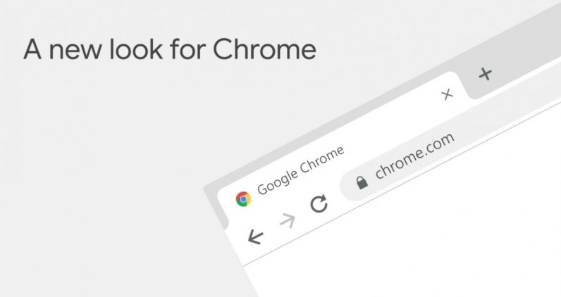
Chrome is turning ten, and it’s getting a makeover to celebrate. Google today announced a wide set of changes coming to the world’s most popular browser – some aesthetic, and some functional.
Most notably, the app now has a flatter, rounder design more in line with Google’s Material Design principles; these changes will be seen on both mobile and desktop. Website icons are now easier to see when you’ve overloaded a window with tabs, and menus and other design elements have been tweaked and simplified throughout various versions of the app.
(Truth be told, we’ve been seeing these changes in Chrome betas for ages, but it’s nice to finally see them roll out.)
In terms of utility, here are some of the most notable changes:
- Chrome revamped its autofill and password manager to be more accurate across different sites.
- Speaking of passwords, Chrome can now auto-generate a strong password that will be linked to your Google account. Think barebones LastPass, right in Chrome.
- The search bar – officially known as the Omnibox – can now show you more information without needing to open a new tab.
- You can now search for a specific tab within the Omnibox, useful for when you’re inundated with tabs too small to read.
- You’ll soon be able to search through your Google Drive right from the search bar.
- You can now create shortcuts for your favorite sites on the new tab page, as well as set a background image.
The update is rolling out to users today. In case you’re wondering about performance, Google says it continues to work on improving startup time, latency, memory use and more, although it doesn’t seem we’ll see changes there to this particular build.
Hopefully sooner rather than later. A man can dream.
> Read Next: Meet The First Snapdragon 850-Powered Laptop With 25 Hours Of Battery Life
So what do you think of this? Let us know your thoughts in the comments section below, follow us on twitter and facebook for more news and updates.
